Frontend Extensions
Stratos exposes the following extension points:
- Adding new items to the side navigation menu
- Adding new tabs to the Application, Cloud Foundry, Organization and Space views
- Adding new action buttons to the Application Wall, Application, Cloud Foundry, Organization and Space and Endpoint views
- Replace the loading page
- Replace the login page
We use Decorators to annotate components to indicate that they are Stratos extensions.
An example illustrating the various front-end extension points of Stratos is included in the folder src/frontend/packages/example-extensions.
To run Stratos with these customizations see here.
For a walk-through of extending Stratos, see Example: Adding a Custom Tab.
Including modules and routes
To include code and angular routing in your component there needs to be two access points
- A core module that declares your extension components.
- A core routing module that calls
RouterModule.forRoot. This is the root for all routes in your package.
These modules should be made available externally to Stratos by the following steps
- Exported in the package's
public-api.ts, for examplesrc/frontend/packages/example-extensions/src/public-api.ts. The public api should be added to the applicationstsconfig.jsonfor examplesrc/tsconfig.json - Reference as, or imported by, the two modules defined in the
stratossection in the package'spackage.json, for examplesrc/frontend/packages/example-extensions/package.json"stratos": {..."module": "ExampleModule","routingModule": "ExampleRoutingModule"...}
At build time these are then added to a dynamically created module src/frontend/packages/core/src/_custom-import.module.ts and included in the output.
Extension Points
Side Navigation
New items can be added to the Side Navigation menu with extensions.
To do so, annotate the routes for your extension with custom metadata, which Stratos will then pick up and add to the side menu.
A full example is in src/frontend/packages/example-extensions/src/example-routing.module.ts and src/frontend/packages/example-extensions/src/nav-extension.
Your route should have the following metadata in the data field of the route:
Where <TITLE> is the text label to show in the side navigation and <ICON NAME> is the icon to use.
The routing module must be, or referenced by, the core routing module as described above
An example routing module would be:
This approach ensures that the Angular compiler creates a separate chunk for the extension at compile time which can be lazy loaded at run time.
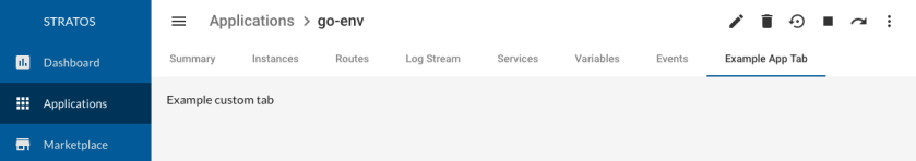
Custom Tabs
Tabs can be added to the following views in Stratos:
- The Application view that shows the detail of an application
- The Cloud Foundry view that shows detail for a Cloud Foundry
- The Cloud Foundry Org view that shows detail for a Cloud Foundry organization
- The Cloud Foundry Space view that shows detail for a Cloud Foundry space
A step by step guide on how to create a custom tab can be found below.
For example:
The approach for all of these is the same:
- Create a new component that will provide the tab contents
- Ensure that your component is included in the
EntryComponentsection of your custom module - Decorate the component with the
StratosTabdecorator, for example:Where:@StratosTab({icon: 'extension',type: StratosTabType.Application,label: 'Example App Tab',link: 'example'})- < ICON > is the material design icon name for the icon
- < TYPE > indicates where the tab should appear and can be:
- StratosTabType.Application - Application View
- StratosTabType.CloudFoundry - Cloud Foundry view
- StratosTabType.CloudFoundryOrg - Cloud Foundry Org view
- StratosTabType.CloudFoundrySpace - Cloud Foundry Space view
- < LABEL > is the text label to use for the tab
- < LINK > is the name to use for the route (this must only contain characters permitted in URLs)
An example is included in the file
src/frontend/packages/example-extensions/src/app-tab-extension/app-tab-extension.component.ts.
- Declare the component to avoid Angular tree shaking. In the same module that the component is 'declared' in add the following to
importsExtensionService.declare([<component name>,])The module referencing the component, or another referencing it, must be imported by the core module as described above.
Custom Actions
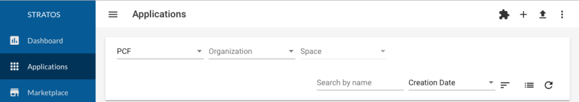
Actions can be added to the following views in Stratos:
- The Application Wall view that shows all applications
- The Application view that shows the detail of an application
- The Cloud Foundry view that shows detail for a Cloud Foundry
- The Cloud Foundry Org view that shows detail for a Cloud Foundry organization
- The Cloud Foundry Space view that shows detail for a Cloud Foundry space
- The Endpoints view that shows all endpoints
An action is a icon button that appears at the top-right of a View. For example:
The approach for all of these is the same:
Create a new component that will provide the contents to show when the action is clicked
Ensure that your component is included in the
EntryComponentsection of your custom moduleDecorate the component with the
StratosActiondecorator, for example:@StratosAction({type: StratosActionType.Applications,label: '<LABEL>',link: '<LINK>',icon: '<ICON>})Where:
- < TYPE > indicates where the action should appear and can be:
- StratosActionType.Applications - Application Wall View
- StratosActionType.Application - Application View
- StratosActionType.CloudFoundry - Cloud Foundry view
- StratosActionType.CloudFoundryOrg - Cloud Foundry Org view
- StratosActionType.CloudFoundrySpace - Cloud Foundry Space view
- StratosActionType.Endpoints - Endpoints view
- < ICON > is the icon to show
- < LABEL > is the text label to use for the tooltip of the icon (optional)
- < LINK > is the name to use for the route (this must only contain characters permitted in URLs)
An example is included in the file
src/frontend/packages/example-extensions/src/app-action-extension/app-action-extension.component.ts.
- < TYPE > indicates where the action should appear and can be:
Declare the component to avoid Angular tree shaking. In the same module that the component is 'declared' in add the following to
imports.ExtensionService.declare([<component name>,])The module referencing the component, or another referencing it, must be imported by the core module as described in above
Loading Indicator
On slower connections, it can take a few seconds to load the main Javascript resources for Stratos.
In order to give the user some initial feedback that Stratos is loading, a loading indicator is included in the index.html file. This gets shown as early as possible, as soon as this main html file has loaded. Once the main code has been fetched, the view refreshes to show the application.
A default loading indicator is provided that can be changed. To do so, create the following two in your extension or theme package:
loading.css- CSS styles to be included in a style block in the head of the index pageloading.html- HTML markup to be included the the index page to render the loading indicator
Then reference them to your package's package.json
The files for the default indicator can be found in the src/frontend/packages/theme/loader folder.
An example of a different loading indicator is included with the ACME sample in src/frontend/packages/example-theme/loader.
The customization task will insert the appropriate CSS and HTML files into the main index.html file when it runs.
Take a look at the template for the index.html file in src/frontend/packages/core/misc/custom/index.html. The CSS file is inserted where the marker /** @@LOADING_CSS@@ **/ is and the HTML file where <!-- @@LOADING_HTML@@ --> is.
Login Page
The log in page can be replaced by another Angular component. This can extend the original log in component and provide the same functionality,
see src/frontend/packages/example-extensions/src/acme-login.
- Create a new log in component that will contain the same form and fields. The component should have the decorator
@StratosLoginComponent()@StratosLoginComponent()@Component({selector: 'app-acme-login',templateUrl: './acme-login.component.html',styleUrls: ['./acme-login.component.scss'],encapsulation: ViewEncapsulation.None})export class AcmeLoginComponent extends LoginPageComponent {... - The new component should be declared and set as an entry point, as well as imported via the extension service, in a moduleimports: [...ExtensionService.declare([AcmeLoginComponent,])...],// FIXME: Ensure that anything lazy loaded/in kube endpoint pages is not included here - #3675declarations: [...AcmeLoginComponent,...],entryComponents: [...AcmeLoginComponent,...]})
Other Points
Customization Service
A customization service provides a number of smaller extension points.
| Property | Description |
|---|---|
| hasEula | True if there's a EULA to show. When set to true the asset /core/eula.html must exist. For information about custom package assets see the images section here. |
| copyright | Text shown at the bottom of the side nav |
| logoText | Text shown with the side nav logo |
| aboutInfoComponent | Replace the component used in the Stratos About page |
| supportInfoComponent | Replace the component used to provide support information int he Stratos About page |
| noEndpointsComponent | Replace the component used in the Endpoints page when there are no registered endpoints |
| alwaysShowNavForEndpointTypes | True to always show the side nav menu items even if an Endpoint for that type is not connected. For example set to false to hide CF based menu items such as Application if no CF is connected |
To utilize these define them in a CustomizationsMetadata object and apply them using the Angular service CustomizationService
stratos.yaml
A few 'higher up' extension points can be found in ./stratos.yaml. For example the SUSE stratos.yaml is below.
| Property | Description |
|---|---|
| title | Official product title, shown in About page and other custom places |
| productVersion | Use when building helm charts |
Example: Adding a Custom Tab
In this example, we will walk through extending the Stratos front-end. A new tab will be added to the Cloud Foundry Application page.
This walk-through assumes that you have installed the Angular CLI globally - this can be done with npm install -g @angular/cli.
Create a new extensions package
Extension packages can contain many components and even a theme. The example here assumes a fresh start so a new package must be created
Create the directory
mdkir src/frontend/packages/my-custom-moduleCreate an angular module in
my-custom-modulecalledmy-example.module.tsimport { CommonModule } from '@angular/common';import { NgModule } from '@angular/core';@NgModule({imports: [CommonModule],declarations: []})export class MyExampleModule { }Create a
public-api.tsinmy-custom-moduleand reference it in your applicationstsconfig.json.public-api.tsexport * from './my-example.module';tsconfig.json"paths": {..."@myexamples/extensions": ["frontend/packages/my-custom-module/public-api.ts"]....}Create a
package.jsoninmy-custom-module{"name": "@myexamples/extensions","version": "0.0.1","peerDependencies": {"@angular/common": "^6.0.0-rc.0 || ^6.0.0","@angular/core": "^6.0.0-rc.0 || ^6.0.0"},"stratos": {"module": "MyExampleModule"}}
Create a new Component for our Tab
Create a new Angular component with the CLI:
This will automatically declare the component in MyExampleModule
Add Decorator to make this Component an Extension
In a text editor, open the file:
Add the following decorator to the component at the top of the file:
The file should now look like this:
Save the file.
Update the module
The component must now be marked as an entry component and imported in such a way angular tree shaking is avoided.
To do this, in a text editor, open the file src/frontend/packages/my-custom-module/my-example.module.ts update
- the file imports section
- the module import array
- the entry component array
Run it
You should now be able to run Stratos locally and see this new tab on the application page for an application.